

Fortal
A Radix Themes-inspired preset theme and widget catalog for Remix
Remix gives you complete freedom to build any design system, which also means it ships no theme of its own. Fortal is the ready-made alternative: a comprehensive set of prebuilt styles based on Radix Themes 3.3.0, providing a polished, modern UI out of the box while remaining fully customizable.
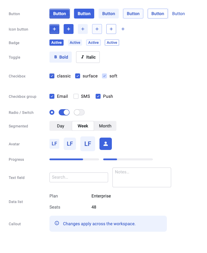
This overview covers installation and theming. Use the Catalog for widget sizes, variants, and defaults, or Typography for text styles. Live examples and their source live on the individual component pages.
Why a separate preset
Fortal lives in its own application-owned preset so that remix stays a
genuinely theme-free component library. If you are building your own design
system on Remix, you pay nothing for a theme you never use. If you choose
Fortal, the CLI copies its token tables, Radix color data, and recipes into your
application, where they become your source.
The repository keeps registry_source (lib/src/fortal) as the analyzed authoring and
Radix parity surface. Consumer applications do not depend on that package.
Installation
The commands below apply after the first CLI release and Remix beta.10. For checkout use, follow the Open Code installation instructions.
flutter pub add dev:remix_cli
dart run remix_cli:remix init --prefix Fortal --preset fortal
dart run remix_cli:remix add button
The Fortal prefix keeps the API names shown throughout this guide. Add each
additional item when you use it, and import your installed lib/ui/ui.dart
barrel from application code.
Quick Start
Wrap your app with FortalScope to provide the design tokens, then use the
Fortal* widgets. Named constructors select a fixed variant; use the unnamed
constructor with variant: when the choice is dynamic:
import 'package:flutter/material.dart';
import 'ui/ui.dart';

class MyApp extends StatelessWidget {
  @override
  Widget build(BuildContext context) {
    return FortalScope(
      child: WidgetsApp(
        color: Colors.white,
        builder: (_, _) => Center(
          child: FortalButton.solid(
            onPressed: () {},
            label: 'Fortal Button',
          ),
        ),
      ),
    );
  }
}
FortalScope is a MixScope, so it satisfies the theme-scope row of Remix's
host capabilities table. Place it above your app widget so
that overlay and route content inherits the tokens.
Scope placement
The outermost FortalScope provides the design tokens and establishes a
courtesy DefaultTextStyle for bare Flutter Text: the Radix theme root run —
text3 (16px, 1.5 line height, 0 letter spacing) at gray-12, regular weight,
with no pinned font family. This is analogous to Material's bodyMedium; it is
not the source of a Fortal typography run. Unsized FortalText, FortalCode,
FortalKbd, and FortalLink resolve their documented defaults directly from
the active scope's tokens.
A nested scope re-scopes tokens without restating the courtesy bare-Text
run. Fortal typography re-resolves against those nested tokens, so gray or
scaling changes apply to the subtree, while ordinary Flutter text keeps its
nearest inherited style.
Use WidgetsApp for the application host. For an application with routes, put
FortalScope in builder, above the Navigator, so pushed routes and dialogs
inherit the same tokens and text style:
import 'package:flutter/widgets.dart';
import 'ui/ui.dart';

class MyApp extends StatelessWidget {
  const MyApp({super.key});

  @override
  Widget build(BuildContext context) {
    return WidgetsApp(
      color: const Color(0xFFF8FAFC),
      pageRouteBuilder: <T>(settings, builder) => PageRouteBuilder<T>(
          settings: settings,
          pageBuilder: (context, animation, secondaryAnimation) => builder(context),
        ),
      builder: (context, child) => FortalScope(child: child!),
      home: const Center(child: FortalText('Themed')),
    );
  }
}
For app-wide toasts, wrap the Navigator in Overlay.wrap and
RemixToastScope inside this builder, below FortalScope. See the
toast scope example.
The root run is only a fallback for bare Flutter Text, and it follows
Flutter's normal text-style cascade. A nearer DefaultTextStyle, including one
installed by Material or Scaffold, wins for that bare text. Fortal
typography does not inherit it: omitted sizes use the text3 token, and an
explicit size: selects another token size. Transparent, non-accent
FortalCode.ghost is the deliberate exception for foreground only, so it can
blend into surrounding text without inheriting that run's metrics.
If an overlay's text does not inherit your theme, ensure the theme scope wraps the Navigator or Overlay that owns the entry. A scope inside one route cannot theme entries inserted above that route.
Light, dark, and system appearance
FortalScope supplies light and dark preset defaults and follows the system at
the root. Nested scopes inherit the configured pair and active selection.
Customize the pair with theme and darkTheme, or force mode to .light or
.dark. mode: .system follows live platform brightness changes.
import 'package:flutter/widgets.dart';
import 'ui/ui.dart';

Widget withAppearance(Widget child) => FortalScope(
  theme: const FortalThemeConfig(
    accent: FortalAccentColor.indigo,
    brightness: Brightness.light,
  ),
  darkTheme: const FortalThemeConfig(
    accent: FortalAccentColor.indigo,
    brightness: Brightness.dark,
  ),
  mode: FortalThemeMode.system,
  child: child,
);
Supplying only theme makes it the fallback for both modes. Supplying only
darkTheme retains the default or inherited base theme. Direct scope options
such as accent apply to both appearances. Appearance selection uses mode;
the scope no longer accepts a brightness parameter.
For routed WidgetsApp examples, wrap the Navigator with the scope in builder.
A default WidgetsApp also preserves the text defaults of a scope above it. An
explicit WidgetsApp textStyle overrides those outer defaults; a scope inside
the builder establishes its defaults below the app’s text style.
Installed Fortal source uses your prefix: AcmeScope, AcmeThemeData, and
AcmeThemeMode expose the same behavior. No Material application host is needed.
Customizing Fortal Styles
Fortal widgets call the matching fortal*Style recipe internally. Use those
recipes directly when you need a custom Remix widget composition:
import 'package:flutter/material.dart';
import 'ui/ui.dart';

final style = fortalButtonStyle(variant: FortalButtonVariant.solid)
  .borderRadius(.all(const Radius.circular(8)))
  .padding(.horizontal(32))
  .onHovered(.scale(1.05));
Fortal Design Tokens
Fortal styles are built on a robust token system that includes:
- Colors: 12-step accent and gray scales (powered by Radix Colors)
- Spacing: 9-step spacing scale
- Border Radius: 6-step radius scale
- Shadows: 6-level shadow system
- Typography: 9-size type scale
- Border Widths: Consistent stroke weights
You can use these tokens directly in your custom styles:
import 'package:remix/remix.dart';
import 'ui/ui.dart';

final style = ButtonStyler()
  .color(FortalTokens.accent9())
  .padding(.all(FortalTokens.space4()))
  .borderRadius(.all(FortalTokens.radius3()))
  .label(TextStyler().color(FortalTokens.accentContrast()));
Typography
Fortal adds five typography families that base Remix has no counterpart for:
FortalText, FortalHeading, FortalCode, FortalKbd, and FortalLink. They
share one nine-step FortalTextSize scale and one FortalTextWeight enum. See
Typography for widget selection, controls, semantics,
recipe customization, and the documented parity boundaries.
Charts
Fortal provides themed line, bar, and pie recipes backed by mix_chart. Install
the owned chart recipe through the same configured preset:
dart run remix_cli:remix add chartimport 'package:mix_chart/mix_chart.dart';
import 'ui/ui.dart';
final chart = FortalLineChart(
semanticsLabel: 'Weekly revenue',
series: [
LineSeries(
id: 'revenue',
label: 'Revenue',
points: [
ChartPoint(id: 'mon', x: 0, y: 18),
ChartPoint(id: 'tue', x: 1, y: 31),
],
),
],
);Use FortalLineChart, FortalBarChart, and FortalPieChart for the ready-made
widgets. Their matching fortal*ChartStyle() recipes can style the underlying
mix_chart widgets directly.
Icons
Install the optional application-owned icon aliases through the configured preset:
dart run remix_cli:remix add iconsThat item adds remix_ui_icons and creates FortalIcons with the small alias
set used by your UI layer. Add, rename, or remove those aliases as the
application vocabulary evolves. Import
package:remix_ui_icons/remix_ui_icons.dart and use RemixIcons directly when
you need the complete 318-glyph Radix Icons 1.3.2 catalog.
Catalogs, galleries, and drift tests that must enumerate every glyph can import the opt-in index. An application that never imports it keeps full font subsetting:
import 'package:remix_ui_icons/icons_index.dart';

final icon = remixIconsByName['check'];
Soft variants and contrast
Default fortalBadgeStyle(variant: .soft) pairs fill accentA3 with label
accentA11. Step 11 is Radix low-contrast text, not a WCAG AA 4.5:1
guarantee against that fill composited over colorPanelSolid. In light mode
some of the 31 accents miss 4.5:1 on that composite. Dark-mode default and
highContrast: true (label accent12) pass AA. Use highContrast: true when
light-mode soft labels must meet WCAG AA.
Covered components
Every Remix component has a matching Fortal recipe and preset widget. The
Catalog lists every widget with its sizes, variants,
defaults, named constructors, and documented parity boundaries in one place; it
is generated from the same pinned Radix contract that CI holds against the
recipes, so it cannot drift from the code. For usage examples, see the
## Fortal widgets section on each component page.