

Typography
Fortal's Text, Heading, Code, Kbd, and Link widgets on one shared nine-step scale
Fortal ships five typography families — FortalText, FortalHeading,
FortalCode, FortalKbd, and FortalLink — mapped from
Radix Themes 3.3.0. They share one nine-step
size scale (FortalTextSize) and one weight enum (FortalTextWeight) instead
of declaring five parallel copies.
These families live only in the application-owned Fortal preset. There is no
RemixText or RemixHeading: base Remix stays theme-free, and a TextStyler
plus your own tokens is the equivalent there. The examples assume the preset
was initialized with --prefix Fortal as shown in the Fortal overview.
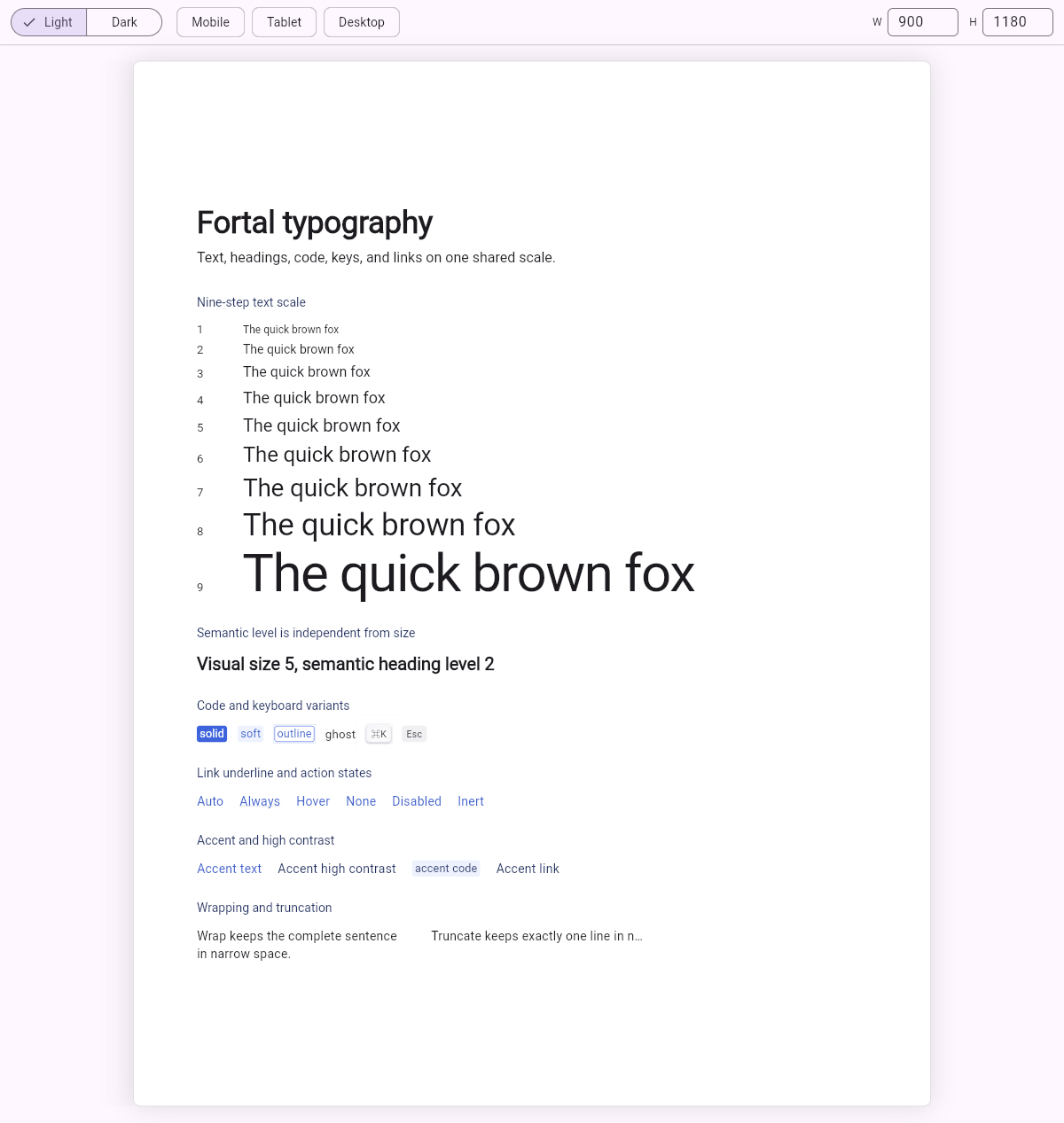
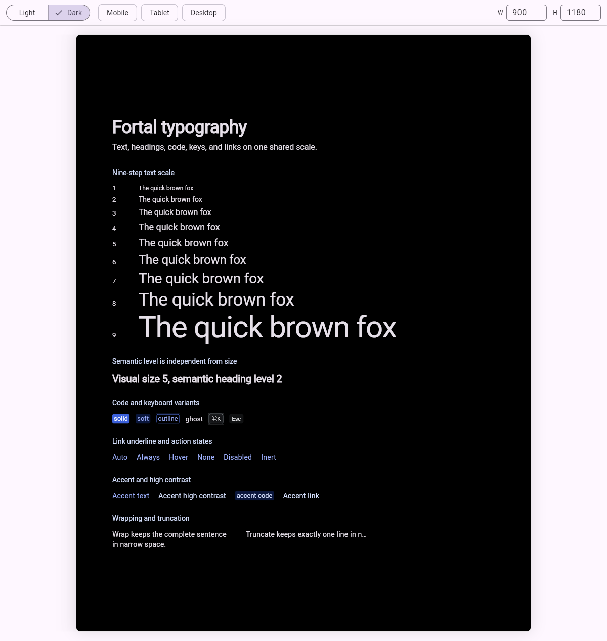
For visual reference, open the light capture or dark capture. These are screenshots, not interactive previews.
Choosing a widget
| Widget | Use it for | Semantics |
|---|---|---|
FortalText | Body copy, labels, values | None; one plain Text node |
FortalHeading | Page, section, and card titles | header with an explicit headingLevel |
FortalCode | Identifiers, snippets, tokens shown inline | None; Flutter has no code role |
FortalKbd | One keyboard key or shortcut | keyboardKey, inert |
FortalLink | Text that navigates | link only while enabled and given an onPressed |
FortalText, FortalCode, FortalKbd, and FortalLink keep nullable public
size fields, but an omitted size resolves the active scope's text3 token
rather than the ambient DefaultTextStyle. FortalText also defaults to the
regular weight token and neutral gray-12; FortalHeading defaults to size 6,
bold, and neutral gray-12.
This deliberately differs from Radix CSS, where an unsized Text renders at
the surrounding 1em. Fortal keeps the upstream Code and Kbd adjustments but
anchors them to tokens: an unsized soft Code resolves
0.95 × 0.95 × text3, and an unsized Kbd resolves 0.75 × text3. Pass an
explicit size: to select another token size.
The outermost FortalScope still establishes the Radix root run as a courtesy
DefaultTextStyle for bare Flutter Text. Under WidgetsApp, put the scope in builder: so that fallback reaches routes and
raw overlays; see scope placement. A nearer
DefaultTextStyle can replace the run for bare text, but never changes Fortal
typography metrics.
A nested FortalScope re-scopes tokens without restating the courtesy
bare-Text run. Fortal typography re-resolves against the nested gray and
scaling tokens, while ordinary Flutter text keeps its nearest inherited style.
Basic implementation
Basic implementation
import 'package:flutter/material.dart';
import 'ui/ui.dart';

class TypographyExample extends StatelessWidget {
  const TypographyExample({super.key});

  @override
  Widget build(BuildContext context) {
    return const Column(
      crossAxisAlignment: CrossAxisAlignment.start,
      spacing: 12,
      children: [
        FortalHeading('Release notes', size: FortalTextSize.size6),
        FortalText(
          'Every recipe resolves through the active Fortal scope.',
          size: FortalTextSize.size3,
        ),
        Row(
          spacing: 10,
          children: [
            FortalCode.soft('FortalScope', size: FortalTextSize.size2),
            FortalKbd.classic(
              '⌘K',
              size: FortalTextSize.size2,
              semanticLabel: 'Command K',
            ),
          ],
        ),
      ],
    );
  }
}
Size, weight, and flow
Every family accepts the same scale and flow controls.
| Control | Type | Applies to |
|---|---|---|
size | FortalTextSize? — size1–size9 | all five |
weight | FortalTextWeight? — light, regular, medium, bold | Text, Heading, Code, Link |
align | TextAlign? | Text, Heading |
softWrap | bool (default true) | Text, Heading, Code, Link |
truncate | bool (default false) | Text, Heading, Code, Link |
accent | bool (default false) | Text, Heading, Code |
highContrast | bool (default false) | Text, Heading, Code, Link |
truncate deliberately wins over softWrap: it forces exactly one ellipsized
line, which is what a table cell or a row with a fixed-width neighbour needs.
FortalText and FortalHeading use neutral gray-12 unless accent: true
takes the surrounding FortalScope accent at accent-a11; adding
highContrast: true promotes it to accent-12. highContrast alone leaves
the neutral color unchanged — the same gate Radix puts behind
[data-accent-color].
FortalKbd is the exception: it pins its own regular weight, line box, and
gray-12 foreground so a key cap never follows the surrounding copy.
Variants
Code and Kbd variants
import 'package:flutter/material.dart';
import 'ui/ui.dart';

class TypographyVariantsExample extends StatelessWidget {
  const TypographyVariantsExample({super.key});

  @override
  Widget build(BuildContext context) {
    return const Wrap(
      spacing: 12,
      runSpacing: 12,
      crossAxisAlignment: WrapCrossAlignment.center,
      children: [
        FortalCode.solid('solid'),
        FortalCode.soft('soft'),
        FortalCode.outline('outline'),
        FortalCode.ghost('ghost'),
        FortalKbd.classic('⌘K', semanticLabel: 'Command K'),
        FortalKbd.soft('Esc', semanticLabel: 'Escape'),
      ],
    );
  }
}
FortalCode.ghost is transparent and inherits the ambient foreground unless you
pass accent: true; the other three variants always paint their own accent
roles. A foreground composed onto the recipe overrides that ambient fallback.
Headings and semantic level
headingLevel drives the accessibility level only. Changing it never changes
the visual size, which is how Radix separates as from size. A page title
can be level 1 at size 6 while an empty-state title stays level 2 at size 3.
Heading level and size
import 'package:flutter/material.dart';
import 'ui/ui.dart';

class HeadingLevelExample extends StatelessWidget {
  const HeadingLevelExample({super.key});

  @override
  Widget build(BuildContext context) {
    return const Column(
      crossAxisAlignment: CrossAxisAlignment.start,
      spacing: 8,
      children: [
        FortalHeading('Overview', size: FortalTextSize.size6),
        FortalHeading(
          'Recent activity',
          headingLevel: 2,
          size: FortalTextSize.size4,
          weight: FortalTextWeight.medium,
        ),
      ],
    );
  }
}
FortalHeading publishes exactly one Semantics node with header: true and
the requested level, and excludes the child so the label is not announced
twice. Pass semanticLabel when the announced text should differ from the
rendered text, or excludeSemantics: true to publish nothing at all.
Actionable versus disabled links
A FortalLink without onPressed is disabled, the same as one with
enabled: false — a null callback disables a Flutter control. It keeps the
accent colour but gives up its focus stop, link role, and activation. Give it
onPressed and it becomes a real link: focusable, activatable with pointer and
Enter, and underlined according to underline.
Every upstream underline rule is gated behind :where(:any-link, button), so a
disabled link never underlines regardless of underline. For accent-coloured
text that was never meant to be followed, use FortalText(accent: true).
Space does not activate a link. That is the Button role's key; a link takes Enter, matching an anchor on the web.
underline | Behaviour when actionable |
|---|---|
auto (default) | Underlines on hover, or always at high contrast |
always | Always underlined |
hover | Underlines on hover only |
none | Never underlined |
A focus-visible outline replaces the underline rather than stacking both, and the outline only appears for keyboard focus — a touch or pointer focus keeps the idle treatment.
Links
import 'package:flutter/material.dart';
import 'ui/ui.dart';

class LinkExample extends StatelessWidget {
  const LinkExample({super.key, required this.onOpenDocs});

  final VoidCallback onOpenDocs;

  @override
  Widget build(BuildContext context) {
    return Wrap(
      spacing: 16,
      children: [
        FortalLink(
          'Read the docs',
          underline: FortalLinkUnderline.always,
          linkUrl: Uri.parse('https://docs.page/btwld/remix/fortal'),
          semanticHint: 'Opens the Fortal documentation',
          onPressed: onOpenDocs,
        ),
        const FortalLink('Not available yet'),
      ],
    );
  }
}
linkUrl is assistive metadata only and is never launched. Navigation stays
your responsibility inside onPressed, which keeps the owned recipe free of a
URL launcher dependency. Passing linkUrl without onPressed asserts, because
an announced destination with no activation is a broken promise to assistive
technology.
enabled: false keeps the callback and still refuses focus and activation, so
a link that is only temporarily unavailable can hold on to its destination.
Customizing the recipes
Each widget calls a fortal*Style recipe you can use directly. FortalText and
FortalHeading return a TextStyler; FortalCode and FortalKbd return a
BadgeStyler and FortalLink returns a LinkStyler. All three take a
BuildContext, because their geometry is em-relative to the resolved font size.
Recipe customization
import 'package:flutter/material.dart';
import 'package:remix/remix.dart';
import 'ui/ui.dart';

/// Body text on the Fortal scale with one project-specific neutral tone.
TextStyler mutedBody() => fortalTextStyle(
  size: FortalTextSize.size2,
  weight: FortalTextWeight.medium,
).color(FortalTokens.gray11());

/// The Fortal Code recipe with a wider inline gutter.
BadgeStyler roomyCode(BuildContext context) =>
    fortalCodeStyle(context, size: FortalTextSize.size2)
        .padding(.horizontal(10));
Starting from the recipe keeps the scale, weights, and flow behaviour Fortal's
and layers only what your project actually adds. Reaching for a bare
TextStyler instead re-declares the whole type ramp locally.
Parity boundaries
These are the documented differences from Radix Themes 3.3.0. They are recorded in the package's checked-in parity contract and verified in CI.
- No leading trim. CSS leading trim has no Flutter primitive, so the token line box is painted untrimmed.
- No
prettyorbalancewrapping. Flutter exposes no equivalent line breaker;softWrapandtruncatemap thewrap/nowrappair. - No responsive prop objects. Rebuild with the value your Flutter layout picks instead of passing a breakpoint map.
- No per-instance colour prop. Re-scope
FortalScope.accentaround the subtree rather than colouring one run. FortalCodeis a box, not an inline span. Radix renderscodeinline inside a text run; a Flutter box is a sibling widget, so a Code inside a wrapped sentence does not reflow with it.FortalKbdskips the-0.03emnudge. Radix nudges the cap up and aligns it withvertical-align: text-top; a standalone Flutter box has no inline baseline to align against.- Link underline geometry is approximate. Flutter reads
decorationThicknessas a multiple of the font's own underline thickness rather than a CSS length, and exposes no underline offset. The decoration colour approximates Radix'scolor-mix(in oklab, …)with an sRGB blend. - No
Em,Strong,Quote, orBlockquote. UseFortalTextwith an explicit weight where Radix would useStrong.